Top Projects at DCAD (2012-2014)

Over the course of the past two years I have worked with media that were either ill-favored or in a new technique, and have learned to appreciate and capitalize on all. The Delaware College of Art and Design has rounded my art skills and knowledge to a higher level of understanding that will allow me to continue my education and future career. Among the mass amount of work done, my favorite and most successful pieces include:

1. Paper Lantern

This project was given in Lisa Baird’s Three-Demensional Design class in the Fall of 2012. Constructed and cut out of Bristol board and spray painted key lime green once assembled.

2. Chocolate Bar Packaging

This branding exercise was the final project for John Breakey’s Graphic Design II class in the Spring of 2014. The concept of “‘ZZA chocolates” was the sweet and salty flavor combination and nation-wide love for pizza. Pineapple, kale leaf, and “crust”  illustrations were done in gouache (adjusted in Photoshop and Illustrator), and text was added in InDesign. Final prints were on textured, cream-colored card stock, and I made the pizza-slice-shaped chocolate bars to place inside the packages.

3. UPS Logo

The redesigning of the UPS logo was based around the tagline “We Love Logistics” and guidelines including: running figure, carrying a package, use of correct CMYK colors, and optional use of the Logistics heart symbol. Done in the Fall Semester of 2013.

4. MidAtlantic Wine & Food Festival Poster

For the annual MidAtlantic Wine & Food Festival, the organization reached out to John Breakey and his Graphic Design II class (Fall 2013). The request turned into a months-long project, and resulted in four 11 x 17 inch poster designs.

5. New Yorker Cover Illustration

For Alexi Natchev’s Illustration I class in the Fall of 2013, students were encouraged to create non-digital artwork to be placed as a plausible cover for The New Yorker. The theme was Thanksgiving / autumn, and the concept I decided on was a play on the Chik-fil-A “Eat Mor Chikn” by replacing the cow with a turkey (dressed up as a pig) holding a sign that says “Eat Mor  Turkey” with an arrow pointing towards a lackadaisical pig (dressed up as a turkey). Watercolor pencils on water color paper with digitally added text.

6. Playing Cards (Faces)

In Alexi Natchev’s Illustration I class (Fall 2013) the historical importance of playing cards introduced the design project. After four concept ideas, I decided on an astrological zodiac theme (Leo, Pisces, Aries, and Cancer). Printed on 8.5 x 11 inch matte card stock.

7. Photography Shooting Assignment (Choice)

For the last shooting assignment of Leon Syfrit’s Introduction to Photography: Digital (Spring 2014) the subject matter, color mode, and format of the images were entirely choice based. The set of four that I submitted were a typography / product study, showcasing the different treatments of text on retail items.

8. Type Specimen Book

Done in John Breakey’s Typography II class (Spring 2014). I showcased the typeface Raleway in 9 different weights and numerous point sizes, in approximately 5 different opacities and 2 colors. All spreads and text included were influenced or based on the typographer / graphic designer Jan Tschichold. Final print: card stock (cover), gloss text (inside spreads), 8.5 x 5.5 inches (shut).

9. Type Inspiration Book

Over the course of the Spring 2014 semester of John Breakey’s Typography II class, students were encouraged to complete one piece per week. Every piece for this project had to be influenced or inspired typographically by an already existing work (etc.) and presented as a collection in a portfolio book.

10. Museum Book and Collateral

For the final project in Sarah Zero’s Visual Communications II class (Spring 2014). The “Museum Book” specs / steps for the book includes: choose a topic, break the topic down into four categories, translate the categories into chapter spreads, make a cover and inside cover (front and back), title page, and notes / sources page if necessary. The collateral items consisted of: ticket, t-shirt, poster, and “wild card” designs. The size, layout, material, topic, and information presented was open-ended. Final book print: 9 x 7 inches, grip tape cover, printed image inside cover, card stock / paper stock inside pages. Collateral materials: card stock (ticket and t-shirt design prints), gloss text (poster), and grip tape (stickers).

Homasote Wall

For the end of Visual Communications II each student is allotted the space of one homasote wall along the hallway that the Delaware College of Art and Design’s Mac Lab is located in. Five projects completed during the current semester from this class are to be displayed neatly and properly within the name/title baseline and 2-feet-from-the-ground perimeters. The image below is a draft of how I am planning on laying out my “Make It Work” logo design (yellow), “Simon Says” 8-step guide (blue), “Design Valentine” package (pink), “Museum Book” and collateral (orange), and 10 of my “Design Vitamin” drawings (green). In addition to the projects and my name/title, real-estate for business cards (black) and colophons (for each project) have also been added as an additional rectangle in the corresponding color.

Homasote-Wall-layout

Museum Book: Recap

The Museum Book project was a spread creation / marketing exercise that resulted in a book, consisting of layouts and materials that were specific to the topic. About halfway through the process collateral was introduced, and tickets, a t-shirt design, poster, and “wild card” also had to be designed for the “museum exhibition” that the book was created for.

Over the course of more than a month, I created a “museum book” showcasing the brand VANS for an exhibition tour that I titled “Get To Know: VANS”. The cover of the book was cut out of grip tape, the title and logo on the back cover were spray painted using stencils, and the subtitle and my name in acrylic paint on the front. All of the inside pages were printed on white card stock. An image of the classic rubber waffle sole that is a trademark of all VANS shoes is the inside cover, and to the right is the black title page with white text that appeared on the cover (“VANS” was done in white ink by hand).

Image

The require content in addition to the previous include and About spread (insight on the topic the book is about) and four chapter-spreads. I chose to turn the About spread into an Introduction section, since the first of my four spreads is an About section. The three other spreads in the “VANS Museum Book” include Events, Shoes, and Artists / Athletes, the latter is split into two full spreads. Shown below are the About, Shoes, and Athletes spreads.

Image

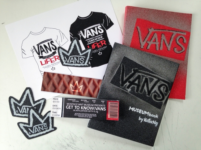
For the collateral, I wanted to pull elements from the Museum Book to keep a consistent vibe, in addition to adding other design elements that embody VANS. The poster was printed on gloss text paper with a faint hand-drawn paisley background and sans-serif typefaces that portray the artistic and clean designs that VANS creates. I created two variations of a t-shirt design, each say “VANS CERTIFIED LIFER” above the exhibition name “Get To Know”, date (May 5th, 2014), location (Scranton PA), museum (Montage Museum), and my logo (three-pointed crown). Typefaces from the poster were used in addition to hand-written type and edited glyphs.

Image

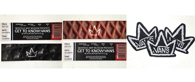
The tickets are two pieces of card stock with a photo-collage of materials from a VANS shoe on either side, including: the waffle sole (original and black), black fabric from the body, white and black stripes of the foxing, and the red shoe tag, with black and white sans-serif text. Like the poster and shirt, the name, date, location, and museum of the exhibition are stated, as well as a price ($20), time (12pm), ticket type (General Admission), and seating information (there but not important because it’s a standing event!). For the wild card, I decided to use more grip tape and cut out my hand-painted logo (white acrylic) in a similar manner as the VANS “Off The Wall” skateboard logo is cut, and added a hand-written “x VANS” to show that this exhibition is a collaborative partnership (even if the whole thing is fictional).

Image

In all, this project is one of my favorites from Sarah Zero’s Visual Communications II class, so much so that I am going to assemble a second book of the same spreads with red grip tape cover and stickers! (Red grip tape cover shown below.)

Image

artist to watch: ZIO ZIEGLER

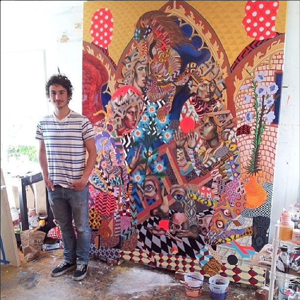
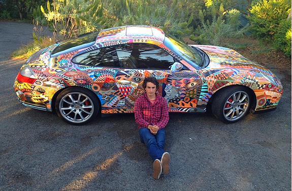
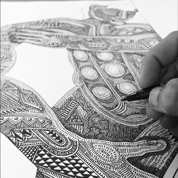
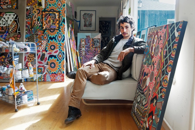
Screen Shot 2014-02-16 at 2.07.48 PMZIO ZIEGLER is a very free-spirited, positive vibes artist who absolutely loves and lives his job with deep understanding and appreciation for history and every day he’s alive – all of which is clearly seen in his work. Most of his pieces are graffiti or painted; from large scale murals, to canvases, and even a Porsche.

Screen Shot 2014-02-16 at 2.06.52 PM

5e6973_96791dfbd5817973174dc294c662eb59.png_srz_575_375_75_22_0.50_1.20_0.00_png_srzHe recently worked as the supporting artist on a Budweiser advertisement that featured Jay Z (clip).  Zio’s excellently rounded education on what inspires his art and his genuine passion are what continuously inspire me.

Screen Shot 2014-02-16 at 2.07.19 PMJuxtapoz (magazine, article link) wrote about his “Chasing Singularity” show at Artists 4 Tomorrow (website). The images I have seen on multiple sites from the show were phenomenal, and Juxtapoz is my favorite art magazine, so naturally I was really excited. Zio’s attitude, outlook, and consistency are a huge admiration of mine. Seeing how far he has come refuels any dilapidated feelings I experience in regards to my own work, and he has only begun to scratch the surface of all the things he is bound to be a part of.

RAW interviewed him at the A4T show, click here to view.

Image

“I care, a lot, sometimes. And it destroys my work. When I give a shit about what people think about my paintings, I can’t paint. When I think about the consequences… I think, expectation fucks with me, it destroys that moment. The Greek have a word for it, called ‘kyros’, and it’s called ‘intuition of the moment’, that’s the meaning. That’s what I want in my paintings – I don’t want to plan, I don’t want to be meticulous. I want to make every time I have an emotion or a change, or something is different, I want to make a new piece of work that embodies that. And I want to change my style, and do this – and I want to contradict myself until I evolve. And when I evolve I want to disrupt that, until I evolve again.” – Zio Zigler